VBUC
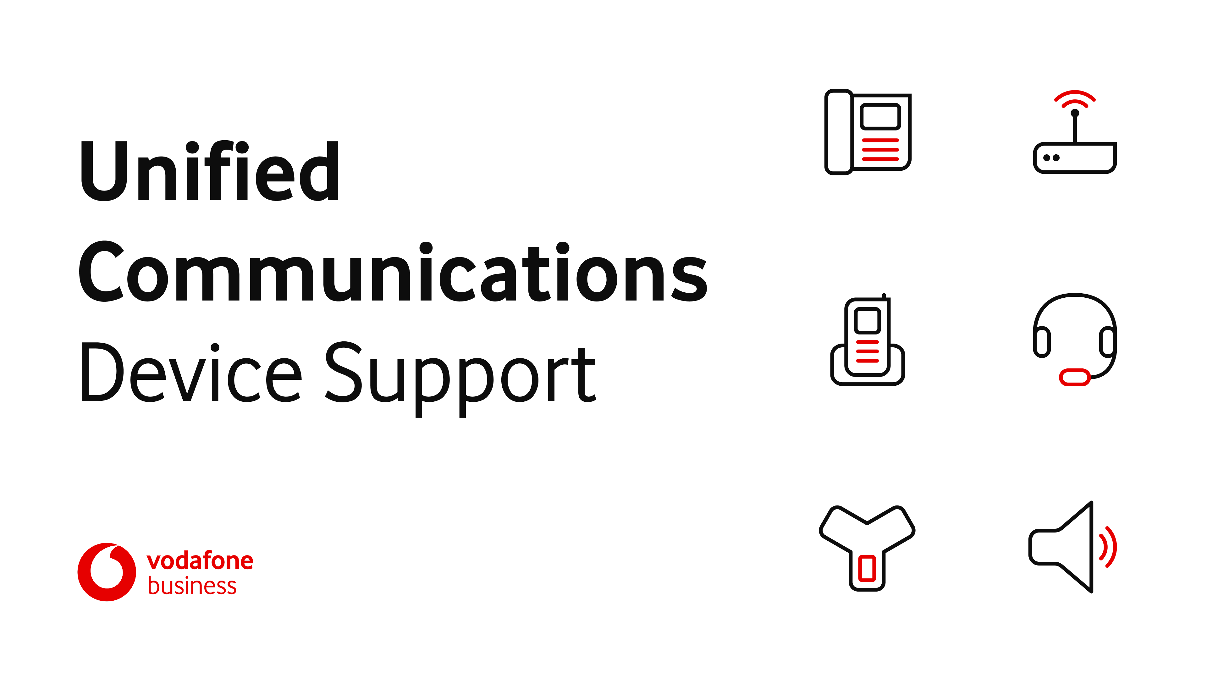
Overview
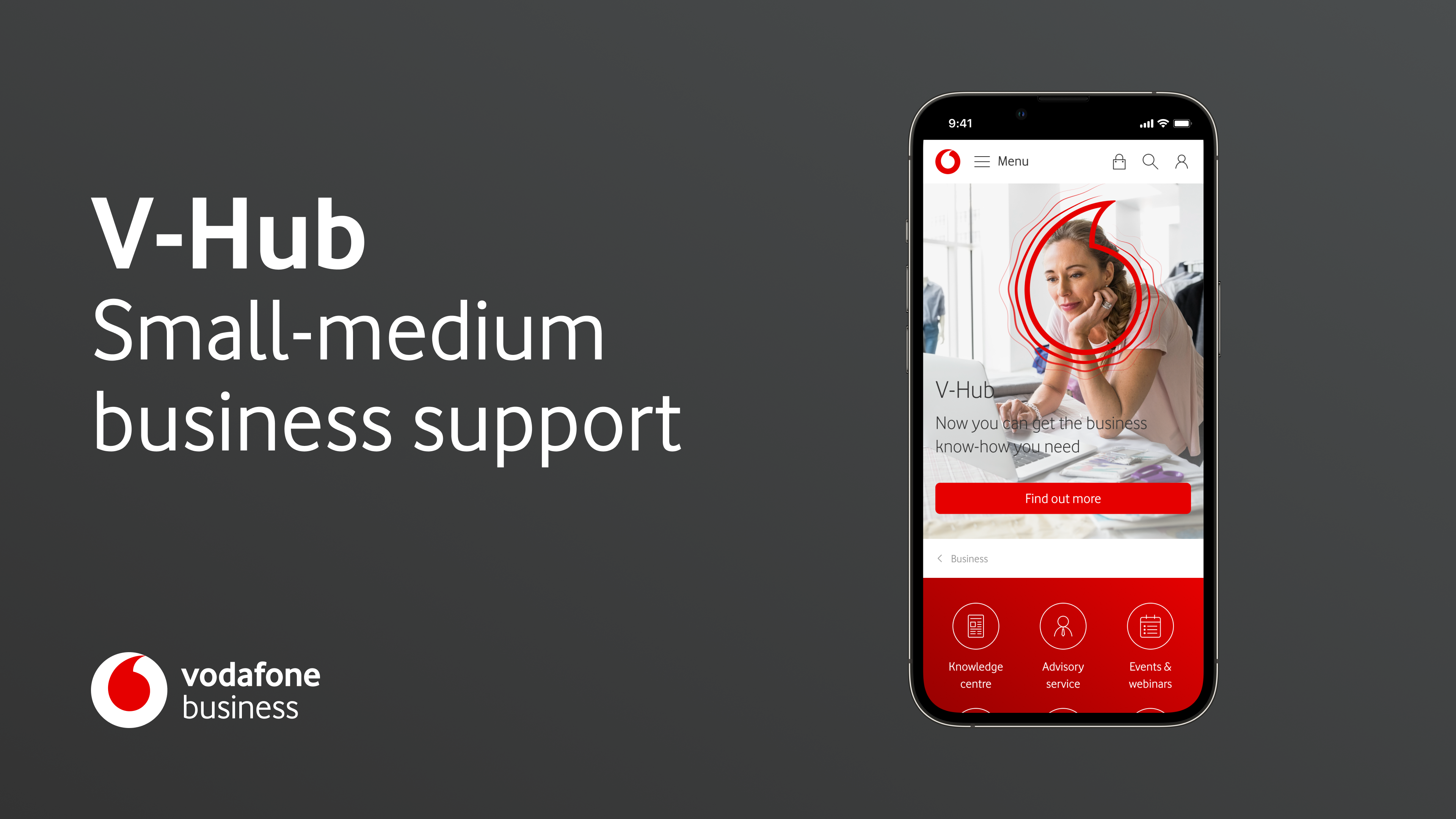
UC Device Support is a new support website for Vodafone Business UC customers that replaces paper manuals with a digital experience for setting up and using their devices.
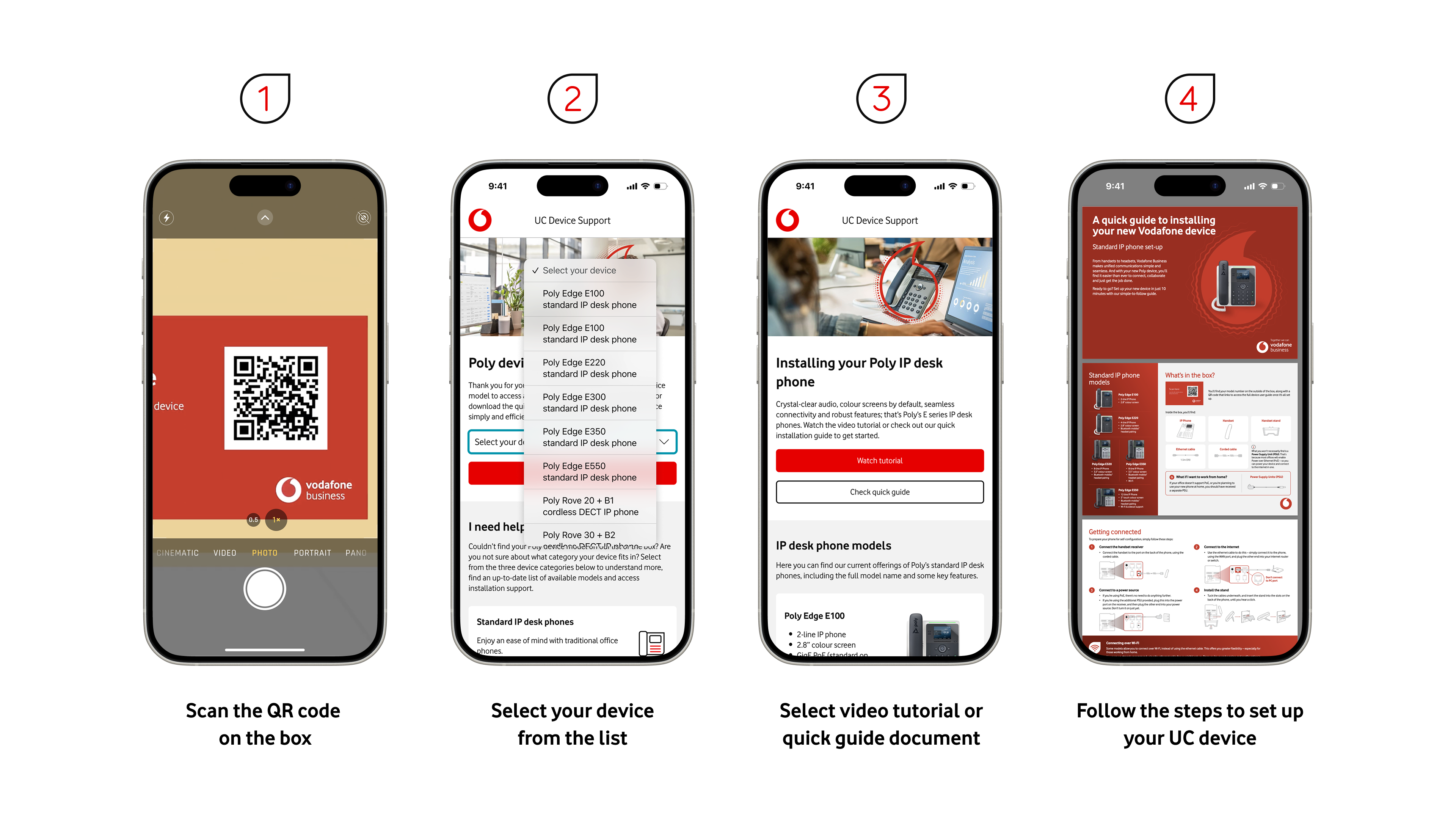
Customers access it either by scanning a QR code printed on the device boxes or via links from Vodafone support pages.
Problems
Previously there was no dedicated self-service website, so users had to rely on paper manuals that were hard to use and often unclear.
Because of this, customer service agents received a high volume of calls about basic device setup and configuration.
Design
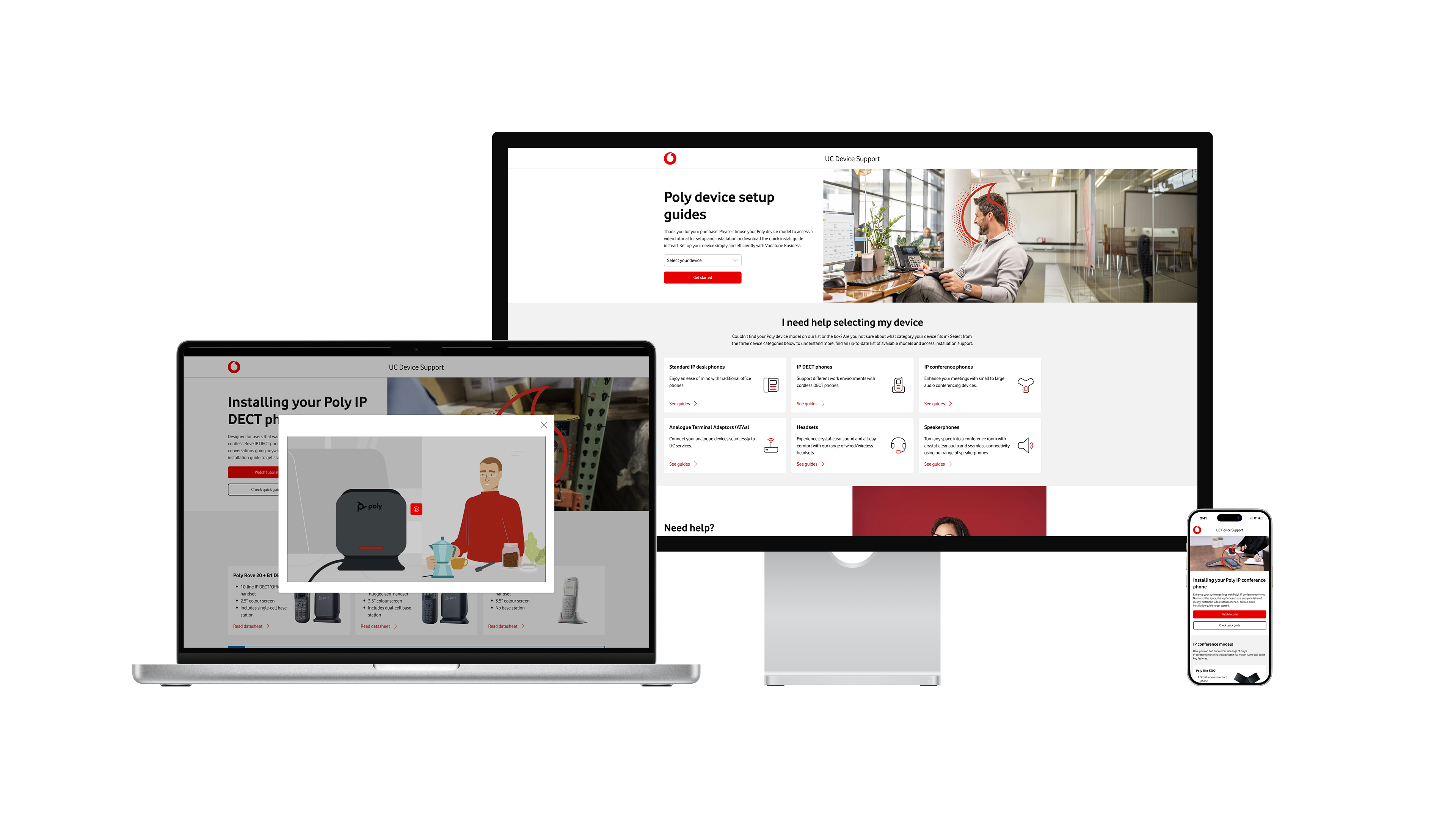
I designed a multi-step experience that helps users quickly find the right resources for their exact device, even if they are unsure which model they have.
Entry:
Users arrive via QR code or support-page links and land in a focused device-support flow.
Device identification:
Users can select their exact device from a dropdown, or if they are unsure, they can choose a device category and then identify it based on device characteristics and supporting images.
Support content:
After selecting a device, users can access quick-install guides, tutorial videos, and full user manuals, with a complete step-by-step install guide created to walk them through the process end to end.
Safety net:
Customer service agents remain available if users still need help, but the primary path encourages self-service.
Outcomes
By moving from paper-only instructions to a structured digital experience, the volume of setup-related calls to customer service agents dropped by 39%.
The new website gives customers clearer guidance and choice of format (video, quick-install, or full manual), while agents can focus on more complex issues instead of repetitive setup questions.
"Working with the team was an absolute pleasure. Collaboration was smooth, communication was prompt and professional, and the team consistently demonstrated a proactive approach throughout the project. I especially appreciated the team's ability to offer improved solutions that added real value to the outcome.
The quality of the work delivered was exceptional—far beyond expectations. The team's expertise and attention to detail truly stood out, making the entire process seamless and enjoyable.
Overall, it was a joy to work with such a dedicated and skilled group, and I’m looking forward to continuing our collaboration in future projects."
Andrew Newbury
Global UCaaS Product Manager
Portfolio


VBUC
Overview
UC Device Support is a new support website for Vodafone Business UC customers that replaces paper manuals with a digital experience for setting up and using their devices.
Customers access it either by scanning a QR code printed on the device boxes or via links from Vodafone support pages.
Problems
Previously there was no dedicated self-service website, so users had to rely on paper manuals that were hard to use and often unclear.
Because of this, customer service agents received a high volume of calls about basic device setup and configuration.
Design
I designed a multi-step experience that helps users quickly find the right resources for their exact device, even if they are unsure which model they have.
Entry:
Users arrive via QR code or support-page links and land in a focused device-support flow.
Device identification:
Users can select their exact device from a dropdown, or if they are unsure, they can choose a device category and then identify it based on device characteristics and supporting images.
Support content:
After selecting a device, users can access quick-install guides, tutorial videos, and full user manuals, with a complete step-by-step install guide created to walk them through the process end to end.
Safety net:
Customer service agents remain available if users still need help, but the primary path encourages self-service.
Outcomes
By moving from paper-only instructions to a structured digital experience, the volume of setup-related calls to customer service agents dropped by 39%.
The new website gives customers clearer guidance and choice of format (video, quick-install, or full manual), while agents can focus on more complex issues instead of repetitive setup questions.
"Working with the team was an absolute pleasure. Collaboration was smooth, communication was prompt and professional, and the team consistently demonstrated a proactive approach throughout the project. I especially appreciated the team's ability to offer improved solutions that added real value to the outcome.
The quality of the work delivered was exceptional—far beyond expectations. The team's expertise and attention to detail truly stood out, making the entire process seamless and enjoyable.
Overall, it was a joy to work with such a dedicated and skilled group, and I’m looking forward to continuing our collaboration in future projects."
Andrew Newbury
Global UCaaS Product Manager

Portfolio
VBUC
Overview
UC Device Support is a new support website for Vodafone Business UC customers that replaces paper manuals with a digital experience for setting up and using their devices.
Customers access it either by scanning a QR code printed on the device boxes or via links from Vodafone support pages.
Problems
Previously there was no dedicated self-service website, so users had to rely on paper manuals that were hard to use and often unclear.
Because of this, customer service agents received a high volume of calls about basic device setup and configuration.
Design
I designed a multi-step experience that helps users quickly find the right resources for their exact device, even if they are unsure which model they have.
Entry:
Users arrive via QR code or support-page links and land in a focused device-support flow.
Device identification:
Users can select their exact device from a dropdown, or if they are unsure, they can choose a device category and then identify it based on device characteristics and supporting images.
Support content:
After selecting a device, users can access quick-install guides, tutorial videos, and full user manuals, with a complete step-by-step install guide created to walk them through the process end to end.
Safety net:
Customer service agents remain available if users still need help, but the primary path encourages self-service.
Outcomes
By moving from paper-only instructions to a structured digital experience, the volume of setup-related calls to customer service agents dropped by 39%.
The new website gives customers clearer guidance and choice of format (video, quick-install, or full manual), while agents can focus on more complex issues instead of repetitive setup questions.
"Working with the team was an absolute pleasure. Collaboration was smooth, communication was prompt and professional, and the team consistently demonstrated a proactive approach throughout the project. I especially appreciated the team's ability to offer improved solutions that added real value to the outcome.
The quality of the work delivered was exceptional—far beyond expectations. The team's expertise and attention to detail truly stood out, making the entire process seamless and enjoyable.
Overall, it was a joy to work with such a dedicated and skilled group, and I’m looking forward to continuing our collaboration in future projects."
Andrew Newbury
Global UCaaS Product Manager
Portfolio