Vodafone eSIM

Overview
Vodafone’s eSIM app allows travellers to discover, purchase, and activate local data plans before or during their trips, directly from their iOS devices.
The redesign project modernised the experience with updated components, streamlined flows, and closer alignment with Apple’s Human Interface Guidelines to make choosing a roaming plan feel simple.
Problems
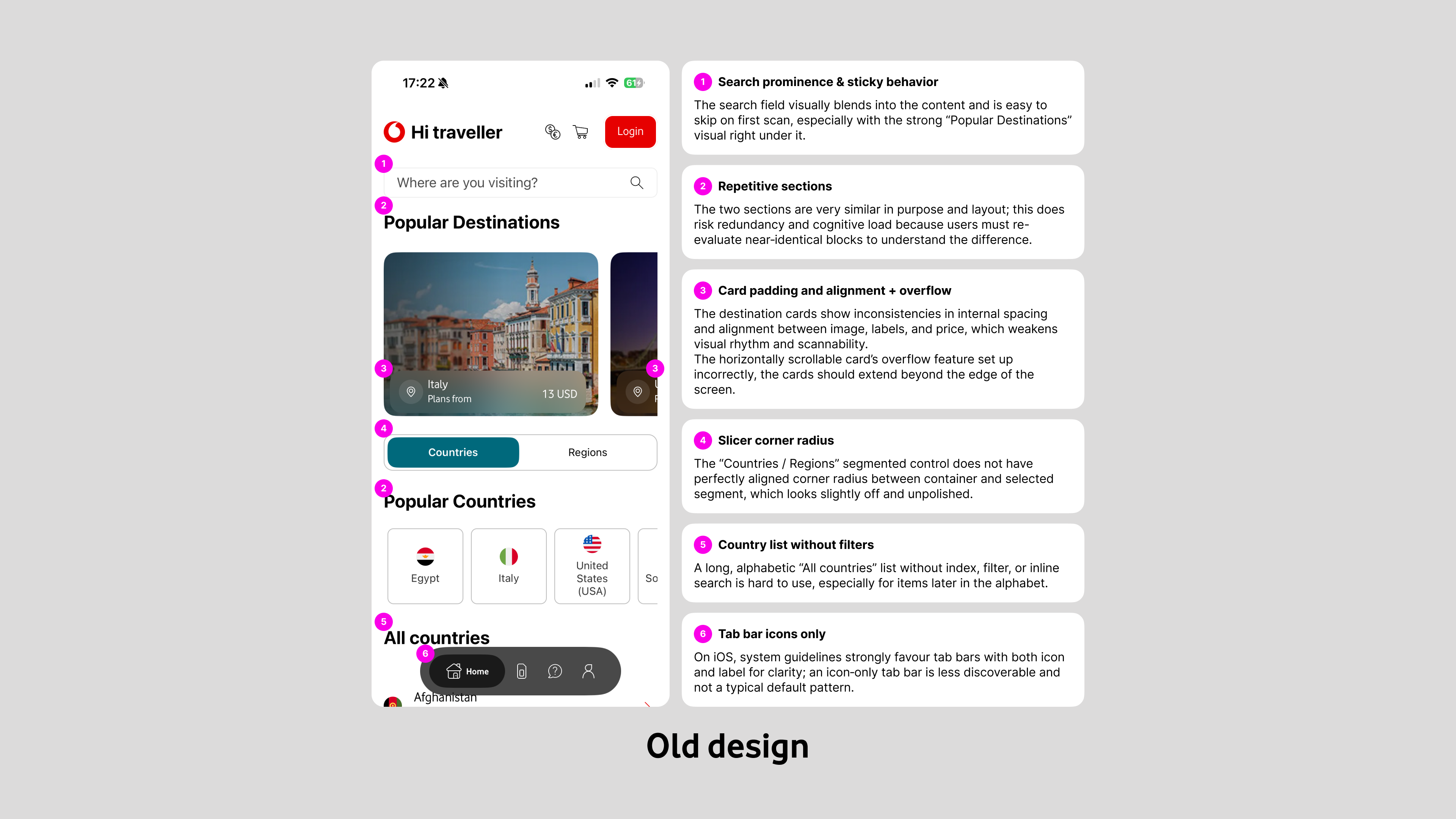
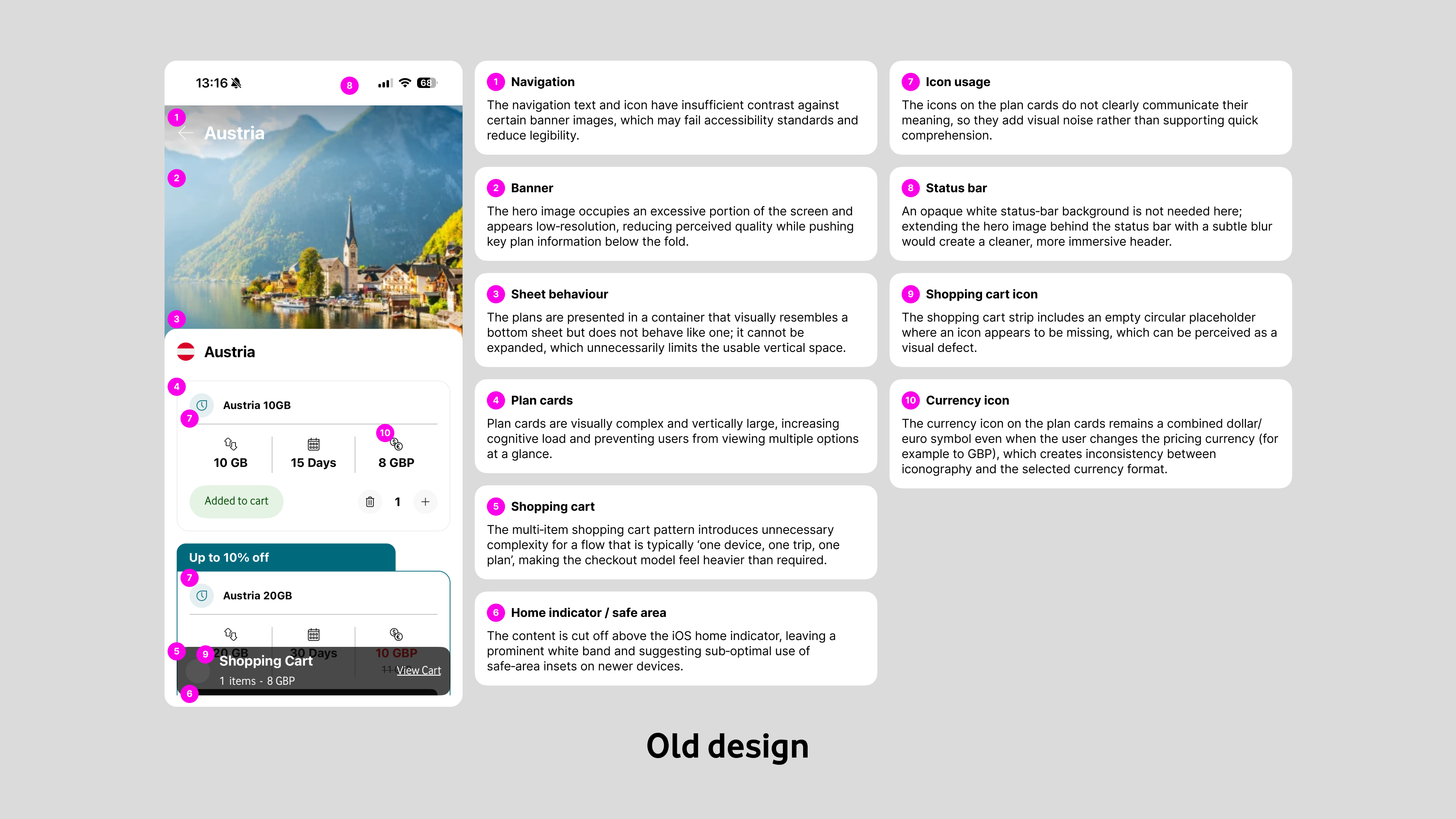
The original experience relied heavily on large, full-bleed imagery with text and icons laid over photos, which often made navigation labels and country names hard to read and failed basic accessibility contrast standards.Plan information was presented in dense, card‑like sheets where multiple visual styles, misaligned paddings, and long banners competed for attention, creating unnecessary cognitive load when comparing options.On the purchase side, the app used a shopping-cart model that encouraged adding multiple plans, even though the real-world behaviour is typically “one device, one trip, one plan.”
This pattern added steps (add to cart, open cart, review, then purchase), duplicated information, and introduced edge cases without clear user value.Navigation also suffered from repetition and inconsistency: the home screen and country pages reused similar entry points, the search field was easy to miss and not sticky on long lists, and the “All countries” view had no filtering or quick way to reach destinations later in the alphabet.
Design
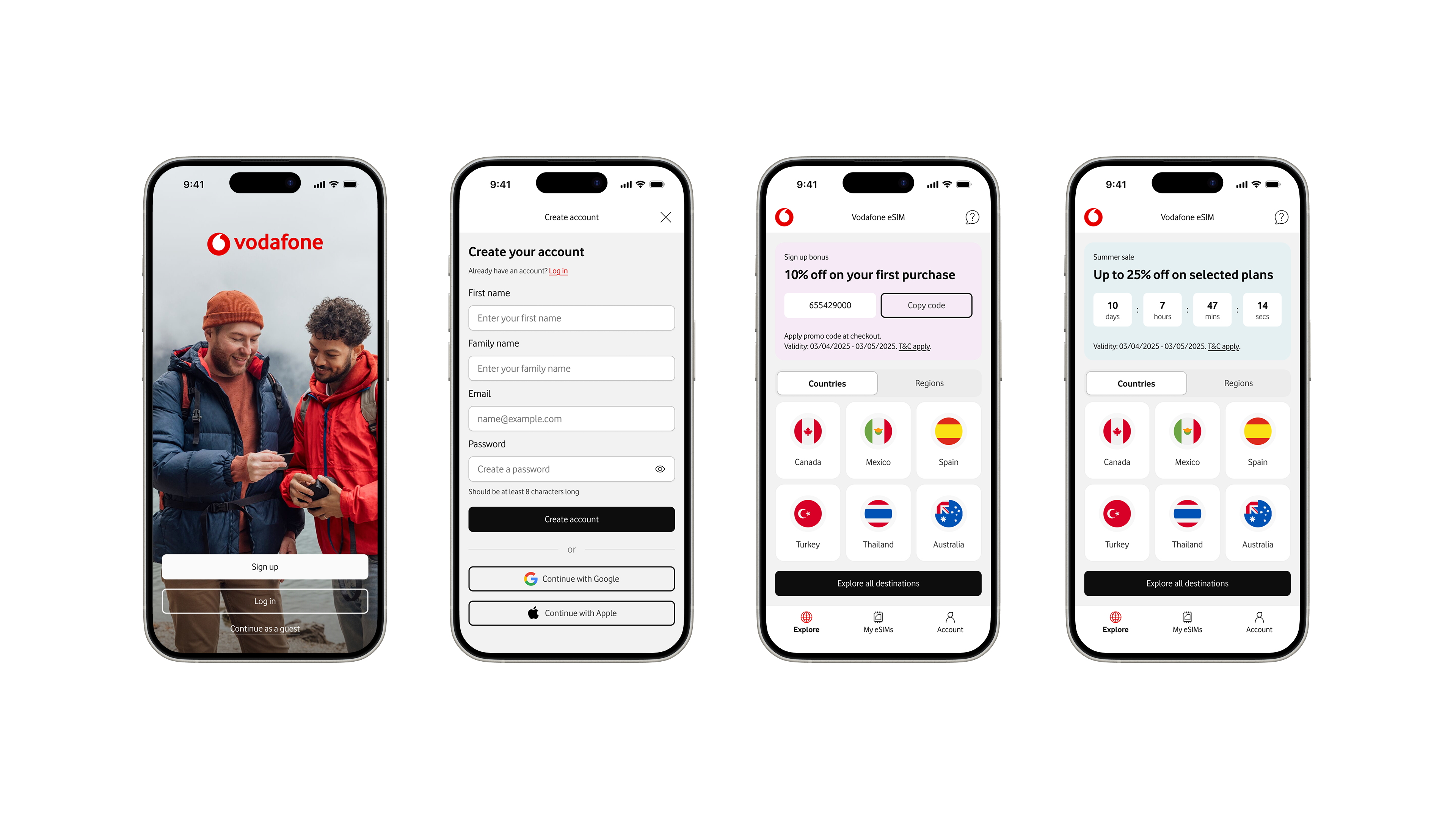
I started by simplifying the information architecture and core flows around the single most common job-to-be-done: pick a destination, choose one plan, and check out.
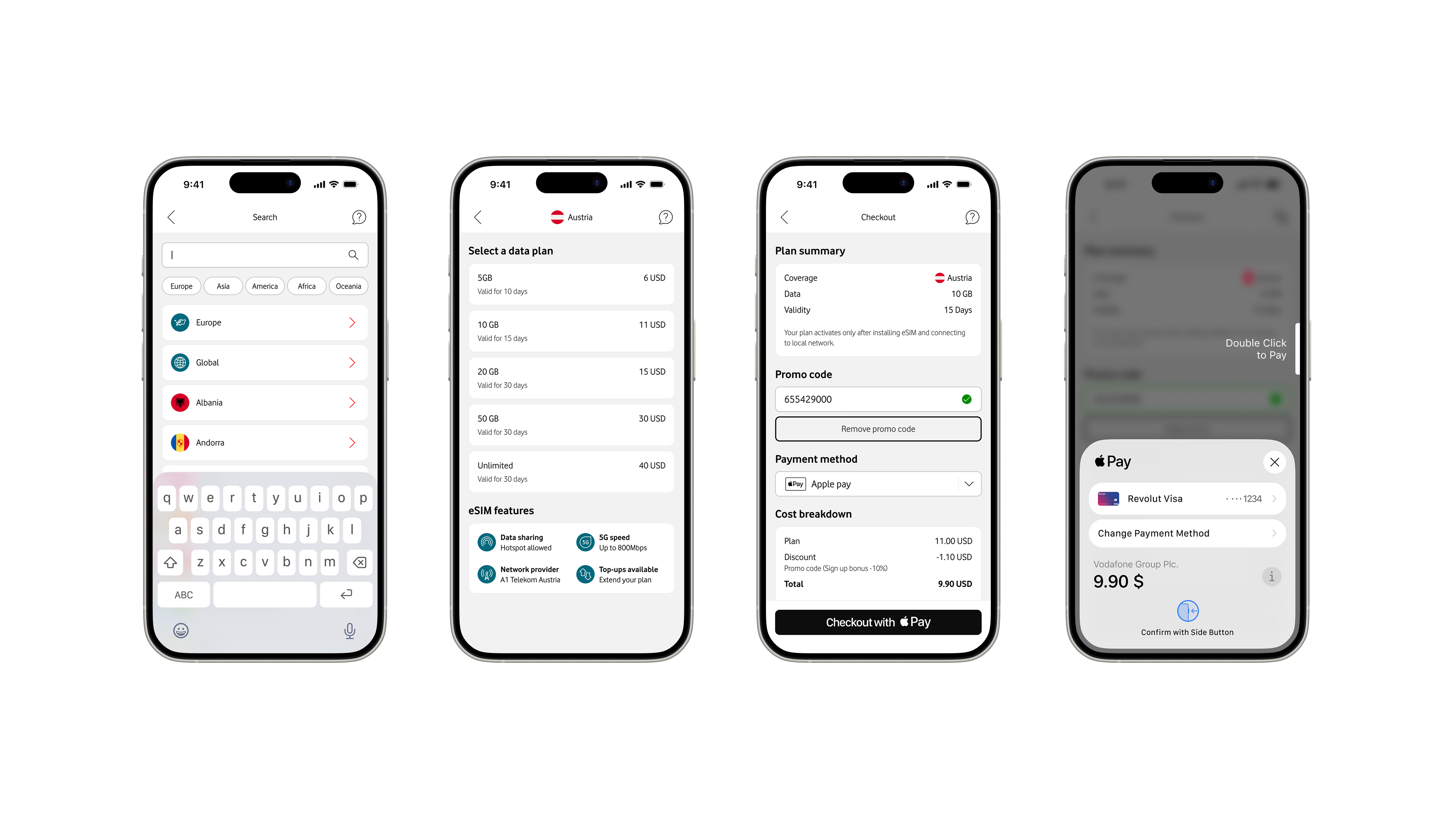
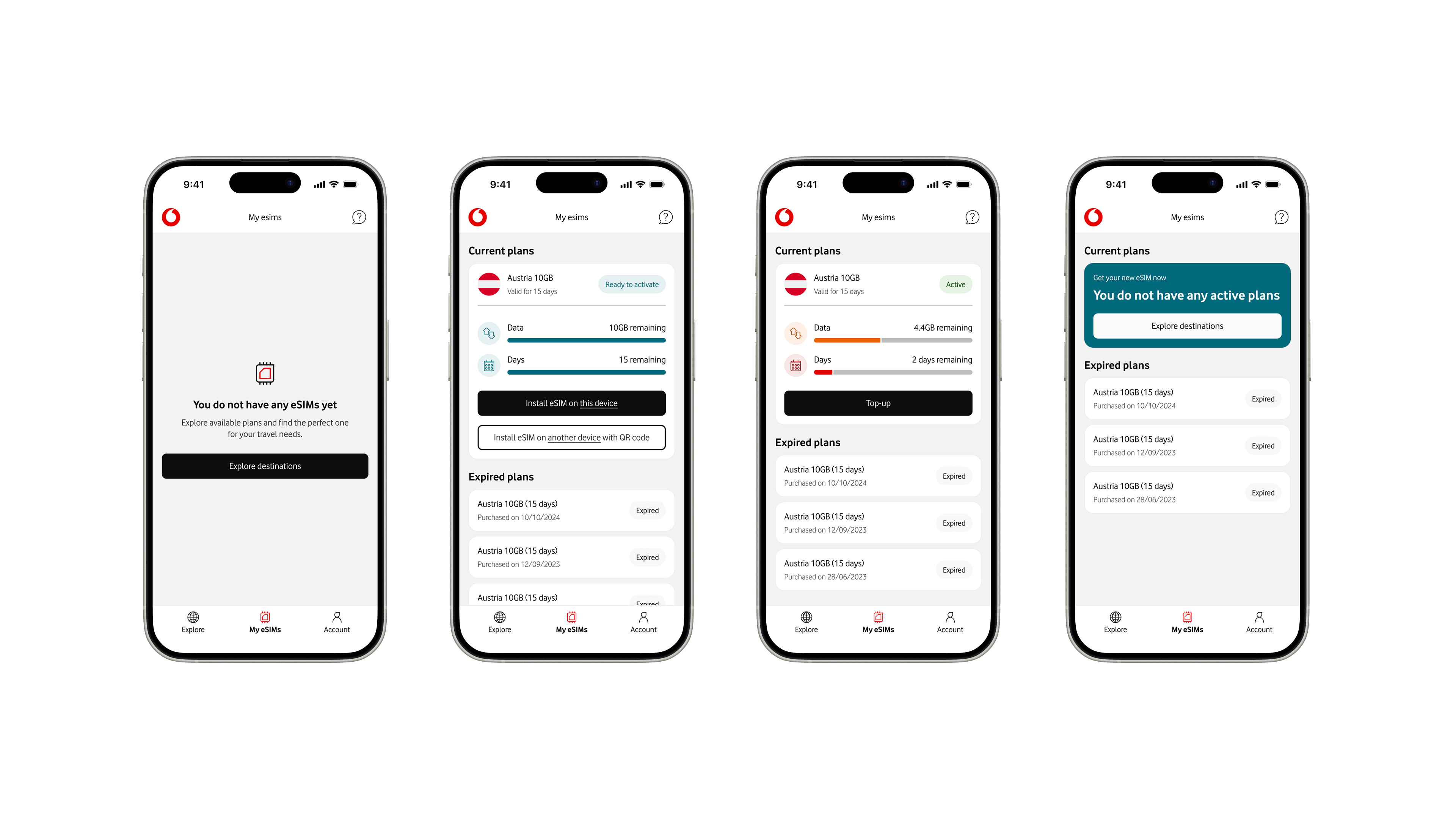
The shopping cart was removed entirely; users now pick a country, review a short list of clearly differentiated plans, and go straight into a focused, single-plan checkout, which reduces steps and cognitive overhead.
Plan cards were redesigned to be much lighter and more scannable: each card now surfaces only the essentials (data allowance, validity period, and price), uses consistent spacing and typography, and avoids nested buttons or badges that previously cluttered the layout.
This makes side‑by‑side comparison easier and lets users understand their options at a glance rather than parsing mini “flyers” of marketing content.
Across the app I followed native iOS patterns and Human Interface Guidelines: clear titles, predictable navigation, appropriate use of safe areas, system typography, and controls that feel familiar to iOS users.
I removed repetitive links and components, introduced more consistent card styles, and ensured that labels and icons sit on solid backgrounds to maintain legibility.
Portfolio


Vodafone eSIM
Overview
Vodafone’s eSIM app allows travellers to discover, purchase, and activate local data plans before or during their trips, directly from their iOS devices.
The redesign project modernised the experience with updated components, streamlined flows, and closer alignment with Apple’s Human Interface Guidelines to make choosing a roaming plan feel simple.
Problems
The original experience relied heavily on large, full-bleed imagery with text and icons laid over photos, which often made navigation labels and country names hard to read and failed basic accessibility contrast standards.Plan information was presented in dense, card‑like sheets where multiple visual styles, misaligned paddings, and long banners competed for attention, creating unnecessary cognitive load when comparing options.On the purchase side, the app used a shopping-cart model that encouraged adding multiple plans, even though the real-world behaviour is typically “one device, one trip, one plan.”
This pattern added steps (add to cart, open cart, review, then purchase), duplicated information, and introduced edge cases without clear user value.Navigation also suffered from repetition and inconsistency: the home screen and country pages reused similar entry points, the search field was easy to miss and not sticky on long lists, and the “All countries” view had no filtering or quick way to reach destinations later in the alphabet.
Design
I started by simplifying the information architecture and core flows around the single most common job-to-be-done: pick a destination, choose one plan, and check out.
The shopping cart was removed entirely; users now pick a country, review a short list of clearly differentiated plans, and go straight into a focused, single-plan checkout, which reduces steps and cognitive overhead.
Plan cards were redesigned to be much lighter and more scannable: each card now surfaces only the essentials (data allowance, validity period, and price), uses consistent spacing and typography, and avoids nested buttons or badges that previously cluttered the layout.
This makes side‑by‑side comparison easier and lets users understand their options at a glance rather than parsing mini “flyers” of marketing content.
Across the app I followed native iOS patterns and Human Interface Guidelines: clear titles, predictable navigation, appropriate use of safe areas, system typography, and controls that feel familiar to iOS users.
I removed repetitive links and components, introduced more consistent card styles, and ensured that labels and icons sit on solid backgrounds to maintain legibility.
Portfolio